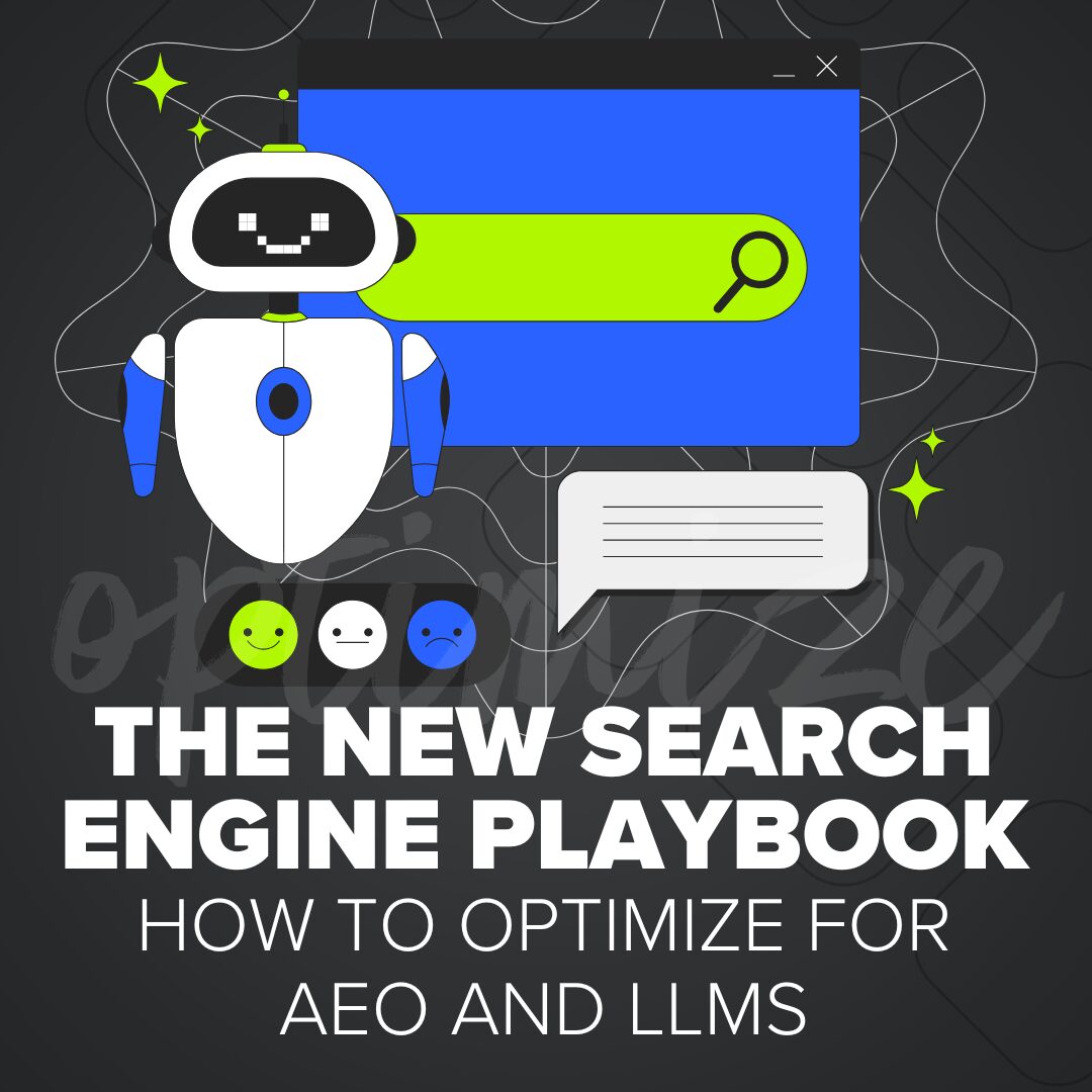
The New Search Engine Playbook:
How to Optimize for AEO and LLMs
What does it take to appear in AI answers? Explore how to optimize for AEO and LLM search with clear…
Read More

The internet is a big and varied universe. So, how do you stand out in a crowd? Discover some clever tips and tricks from the team at Ironistic.
I have a few tricks up my sleeve that I use to grab visitor’s attention:
I like to use big, bold fonts and pair them with brief impactful statements. It’s not overwhelming but captures the users attention.
I like to use subtle geometric textures and patterns in the background of content areas. They’re subtle enough to not interfere with the content, but stand out enough to make a user pause and take a closer look.
I’ve found that more descriptive calls-to-action rather than a simple “learn more” tend to get more clicks from a user.
Bold photography can be really eye catching and if used well can elicit an emotional reaction from the user.
I also like to convert statistics into mini infographics whenever I can. They help break up large blocks of content and also will capture the users attention and get them to focus on your message.


Whenever coming up with a wireframe for a website homepage, I try to imagine that I’m that client’s target audience. What are the business goals that XX company wants me to complete? What flow of content would help me understand the company and complete that action? Getting the initial flow of the homepage will help our (awesome) designer come up with exactly the right elements and look/feel!

Designing websites is kind of a catch-22. You want to make them attractive, but not busy. They should be informative, but not too content heavy. Images should be eye-catching, but definitely relevant to the subject matter. Most importantly, be CLEAR about what you want them to do or where you want to direct their attention. My best advice is don’t go it alone! Seek help from professionals, but also get feedback from a variety of people about what they noticed first or what stood out to them. Fresh eyes are so helpful when improving web functionality.


I like to use design elements (color blocks, background treatments, etc) or visuals (arrows, swooshes, something compelling) to draw users attention to the CTAs or break up the site content. Ideally you can repeat a visual, element, or even a text treatment to help the readers eyes flow down the page and show them what’s important to pay attention to.

Anything that’s different than the other things around them automatically draws a person’s eyes. Keep this in mind when creating a flow through your website. If you really want someone to click something, make sure it stands out from the things around it.


Use high-quality and colorful images, videos, animation, informative content, and create easy navigation for visitors.

Clear photos with a clean, simple layout is the best way for a user not to feel overwhelmed when hopping on your site. It’s important the colors are easy to look at and read on as well with a font that compliments the overall style.


