 Mobile testing from a browser is a great way to enhance development efforts, and Chrome Developer Tools are deep, powerful, and packed full of amazing features to achieve that goal. As a developer, I often take for granted some of the features I use every day. I forget most people don’t even know this area of their browser exists, how to open it, or some of the things they can do with it. In this blog series, I aim to remove the mysticism around these DevTools so that anyone can have more control and power over their website.
Check for Responsiveness
Responsiveness isn’t the traditional starting point for a dive into Chrome DevTools, but I’m choosing to start here for the following reasons:
- Return on Investment
- Ease of Use
We’ve also talked about what it is and its importance several times in the past, which I encourage you to read or revisit as well.
Return on Investment
We are living in a world that requires websites to work on all screen sizes. This isn’t the future; it is the present. If your site isn’t already responsive, you’re suffering in search engines and are likely losing customers to sites that look and work better on their phones. As such, it’s your obligation as a website owner, manager, designer, or developer to frequently check your site on different screen sizes, lest your users find a major issue first. But it’s more than just improving your SEO or creating a better, seamless user experience for users. Studies are showing that most digital media is now consumed on a mobile device. As of early 2016, 65% of all digital media time was spent on a mobile device. Checking for responsiveness is going to be the cheapest and easiest thing you can do to affect your bottom line!
Ease of Use
Unlike many of the other features in the Chrome Developer Tools, checking for responsiveness requires no understanding of HTML, CSS, JavaScript, or how the browser/server work together to display the page. As you’ll see below, it’s just a few clicks before you can start browsing from a phone from your desktop.
How to Check for Responsiveness from a Browser
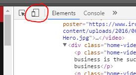
First thing you’re going to want to do is open the developer tools. To do that, you can either right-click anywhere on the website and click Inspect (or Ctrl + Shift + I), or you can hit F12 on your keyboard (note: F12 does not work in macOS, only Windows). Once you do that, you’ll see a box that looks very much like this.

Don’t get overwhelmed! As I said earlier, these Dev Tools are packed with features most developers never even use. 99.9% of it is going to be irrelevant for the purpose of checking responsiveness. Let’s focus on the top left corner of this new window. You’ll see up there an icon with a couple of squares sitting on top of each other (see my poorly drawn indicator below). When you hover over it, it will say Toggle device toolbar.
Click this button and the browser window will pop into a much smaller frame, displaying the site at whatever dimensions you have set. Alternatively, you can press Ctrl + Shift + M.
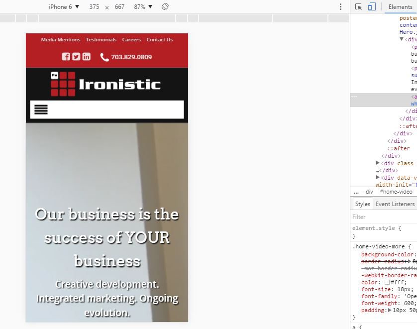
When this frame appears, you have a few options. You can select from one of the preset mobile devices, which is what I usually do, you can set your own dimensions, or you can set the drop-down to Responsive and just drag the frame around however you like. For the sake of expediency, I’ll just focus on the preset mobile devices.
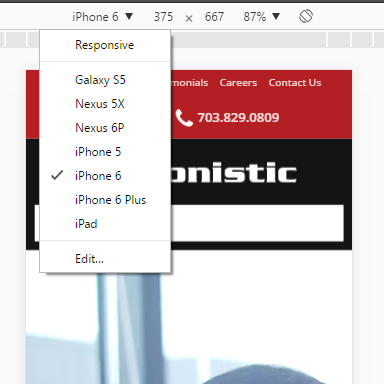
The iPhone 5, at a width of 320, is currently the smallest device on the market (iPhone 2, 3, and 4 had the same width), so if you’re being aggressive — and there’s no reason not to be — you can check that. The iPhone 6 is 375 x 667, which is a good approximation of a medium-sized phone. If you have a specific device in mind that you’d like to check for, you can click Edit... which will open up a whole list of devices you can add (or remove) to this dropdown.
And that’s all there is to it! Now you can scroll around on a phone from the comfort and convenience of your desktop. This is a great way to check your site as you go, seeing how elements of the page break down on smaller screens, how hover effects are interpreted on mobile (hint: they aren’t! Build fallbacks), and how images scale.
There are some cons to this method, however. One bug I’ve noticed, repeatedly, is that some mobile menus don’t always work right on this emulator. More specifically, menus built using Superfish. If some important functionally doesn’t work on this emulator, do check on an actual mobile device before throwing your hands up in frustration. It also doesn’t cover OS/browser differences. For example, if there’s a bug on an iPhone using Safari, you may not be able to recreate it on Chrome with a Windows computer. But for all else, I find this method much quicker, more convenient, and easier to be thorough!
If you have any further tips, questions, or comments, please leave a comment below! I’d love to hear from you. And if there are any other aspects of the Chrome Developer Tools you’d like me to dig into, feel free to reach out and let me know.
Editors Note: This method is great for its speed and specificity, especially for changes as they happen, but if you’re looking for a more birds-eye view about the state of your website, including more than just responsiveness, please check out our recently released Ironscan app for tons of additional information and areas of improvement.


Comments
There are currently no responses.